SOFI
Don’t bank.
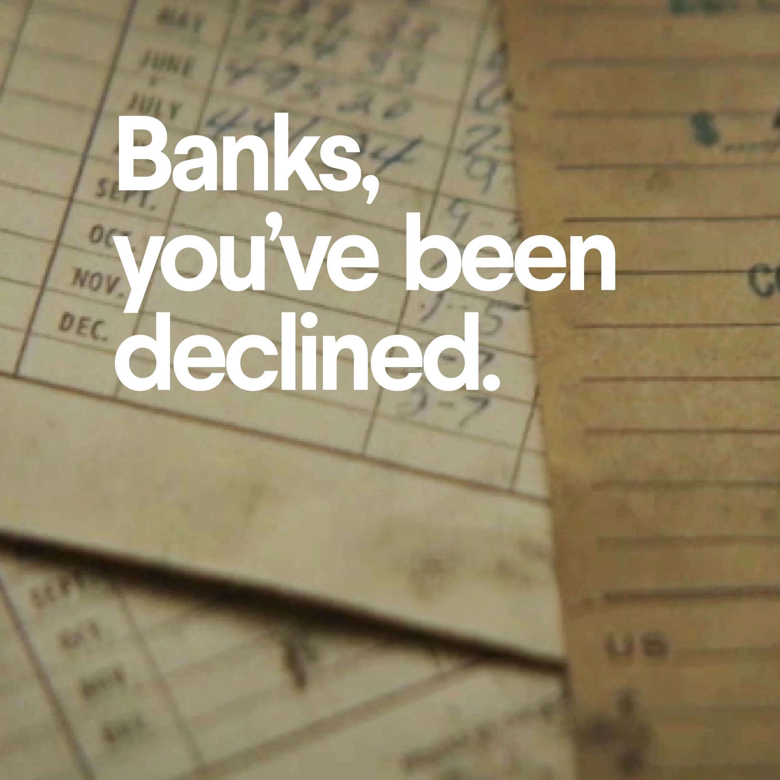
Big banks aren’t too big to fail; they’re too big to succeed. SoFi is not a bank. It is a financial partner created for the 21st century. Don't Bank. SoFi. The Sofi brand system plays the fresh new alternative by being counter to the traditional bank exploiting the consumer's distrust of banks following the 2008′s financial crisis.


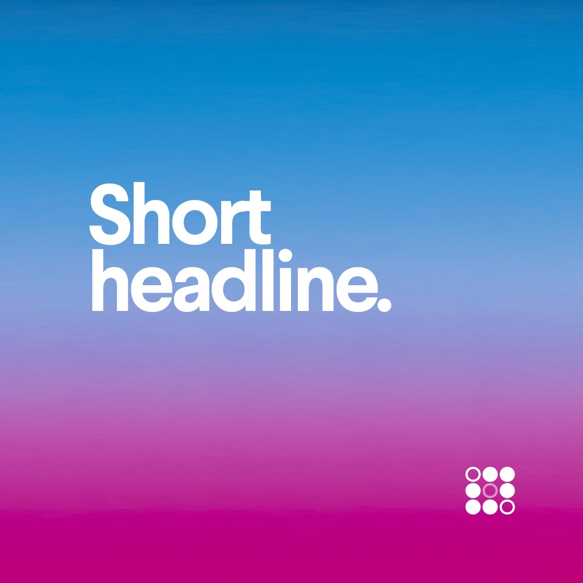
Gradients
The more color,
the marrier.
Trust tends to be communicated using culturally established models, anything foreign risks being perceived with suspicion. It was crucial in developing the brand language to balance what patterns we used and what we played counter to.
For example, our typeface screams "BANK" that we counter with a few quirky letterforms, exaggerated with tight letterspacing. While not radical, it creates a balance and stays trustworthy through a human feel. Where the brand really plays counter to the monotone bank world is a system of steadfast gradients that revel in saturated colors.
COLOR SYSTEM

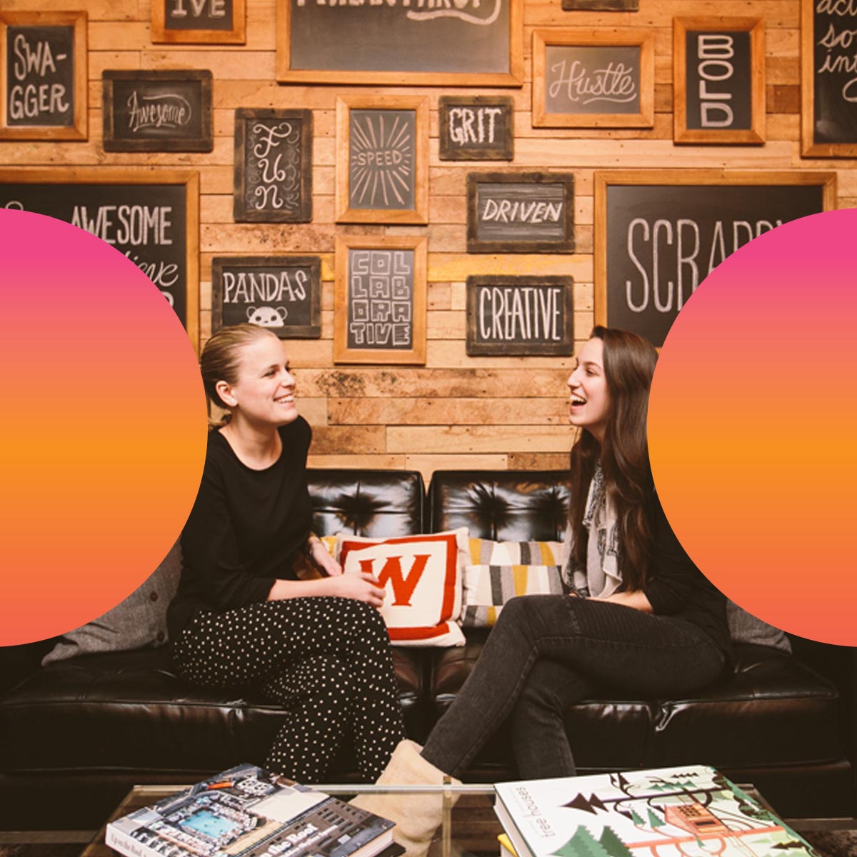
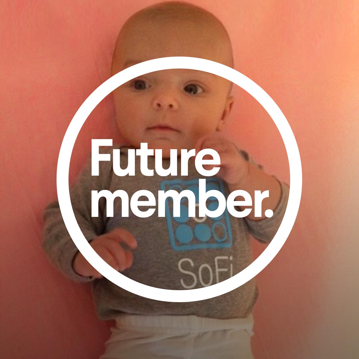
PHOTOGRAPHY TREATMENT


MEMBER PHOTOGRAPHY


Chicken and Egg
From campaign to
brand design system.
SoFi's brand was born out of a campaign that contrasted photography of old broken banks with the new world of SoFi's color ramps and type treatment. But the brand still needed some legs, so it was more than just type and gradients. With the goal of creating the new financial trust, aspects like photography and illustration were developed in tangent with a design system so it could pervade every touch point with consistency.
Brand Design System


show and tell
Demonstrating
Versatility
Visual Systems are best when they follow simple building blocks based on data types. But simplicity can make it difficult to realize its power when just looking at templates. It's essential to demonstrate the complexity that can be created from a simple system while also guiding the systems cadence and diversity in tone.