


most likely to
Design a system.
When I first meet MLT, a logo and the color purple was all these two writers had starting their new agency . I quickly identified strategic needs in the identity and developed a more robust visual system that reinforced the brand concept. Purposely built to augment the structure and form of the existing elements to reinforce a graphic mnemonic echoed in all design elements.
Logo Reduction
COLOR PAlette
PHOTOGRAPHY TREATMENT
Left to right movement
Micro UX
LeanING in
Query
+
Response
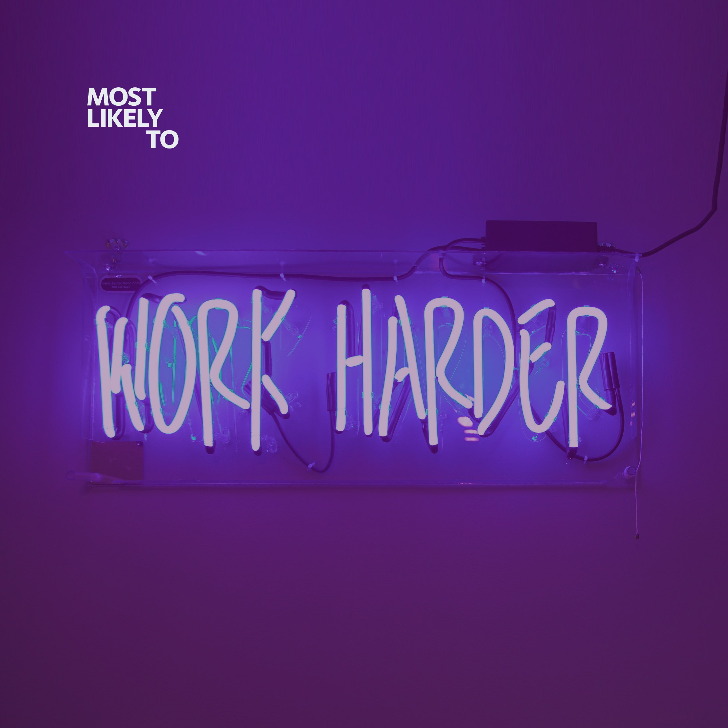
To give purpose to the identity we took the brand name as a platform to frame the brand around the response to the phrase "Most Likely To". This allowed the brand to have a living element that could always be contextual, a storytelling element perfect for two writers. Creative freedom perfect even for the most mundane function it gave everything an inclusive feeling while having permission to be boastful.